Have I truly not published anything here in November? That’s crazy! I guess it’s because my November so far has been packed with friends and fun. I haven’t had time to write.
I continue to enjoy my watercolor class. Like, I really enjoy it. For a hobby/art I never intended to explore, I’ve become surprisingly obsessed with it.
That said, I missed class last Thursday in order to fly to Austin, Texas. I spent the weekend hanging out with F.I. friends (Marla, Bianca, Michael Robinson). We ate and drank and rode scooters around the city. (More about the scooters in the near future.) But I wasn’t in class to get the assignment for this Thursday.
On Tuesday, I asked my instructor what the homework was. “Something abstract,” she said.
“What does that mean?” I asked.
“Oh, you know. Take something from real life and paint it stylized.”
I spent several hours thinking about what I wanted to paint, but couldn’t come up with anything. Then I thought, “What if I paint a concept instead of a thing? That’s abstract!” And like that, I was off to the races.
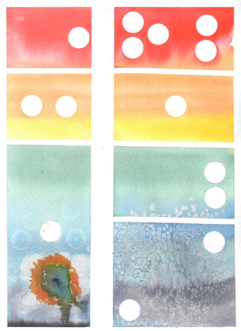
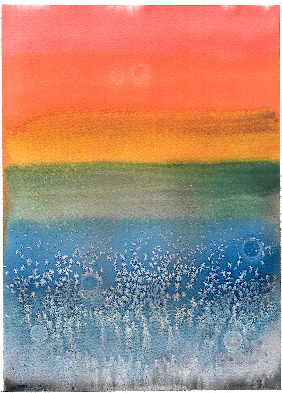
I grabbed a bunch of random stuff I had downstairs in the library (which is doubling as my art studio right now). I used some thing tape to lay out a grid pattern on my apper. I took some circular “garage-sale dots” and placed them mostly randomly in the grid I’d created. Then I realized that I could use the dots to tell a meaningful story, so I re-arranged them.
Once I had my resists in place — a “resist” is anything that blocks the paint, preserving the white of the paper — I had to pick my paints. I have a book specifically about watercolor paints, and it contains a helpful chart of where each pigment rests on the color wheel. Playing with that, I realized that for my composition, I wanted to use the standard ROYGBIV spectrum: red, orange, yellow, green, blue, indigo, violet. I sorted through my paints to find some pleasing hues that I hadn’t used yet. (And I threw in a black.)
After 3-1/2 hours of planning and prep, I set to painting. It took five minutes. This was the result:
I liked the idea of this, but I didn’t like the final product. I made another pass. I spent about thirty minutes setting things up again, then painted this:
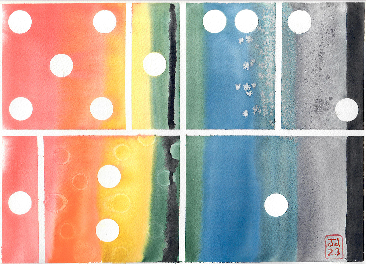
Better, but still not what I wanted. I realized that the vertical orientation made the painting look like a page from a comic book. As a comic-book nerd, I liked that. So, I switched back to vertical. Also, because of my theme (about which I’m being very secretive, sorry), I decided I wanted intense colors, so I squeezed out more paint from the tubes. I ended up with this:
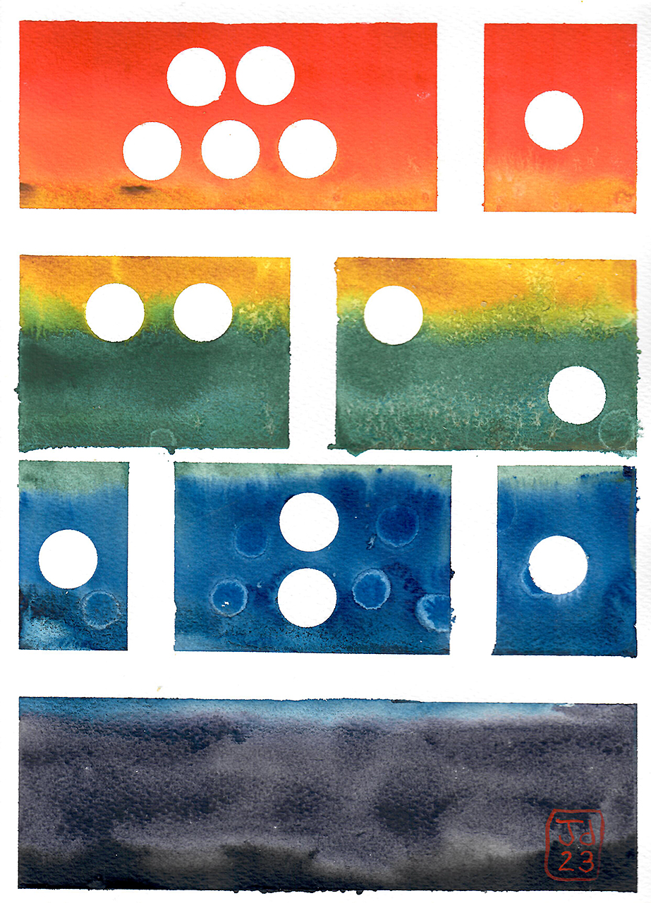
I liked this. A lot. In fact, this is where I stopped. It was exactly what I was trying to express. The one downside is that I’d run out of my thin tape, so I had to use wide tape down for most of it. Not ideal. Still, I took this to class.
My abstract art was the only thing that looked remotely like this. Everyone else took something from real life — a couple under an umbrella, a bunch of carrots, a tomato — and abstracted those things. I was the only one who abstracted a concept and tried to tell a story. All of the paintings were fun though. We students enjoyed the assignment.
On Thursday afternoon, I bought some more thin tape. I did a final version of my abstract painting that looked like this:
Perfect! This is the story I wanted to convey.
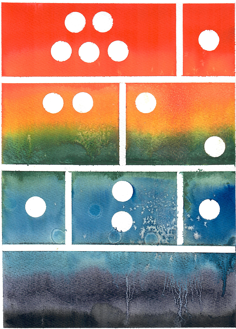
When I showed it to Kim, she had some feedback. “I still don’t like those dots,” she said. I haven’t even told her what they represent. Like I said, I’m, being secretive about the theme of this painting…but each dot means something and none of them can be removed. “I think maybe you could keep one dot. It would look like the rising sun! Also, I’m not a fan of the grid. I know you think it looks like a comic book, but I think it’d look better without them. But you know what I do like? This blue in the lower right. It looks like roots sinking into the earth. In fact, the whole thing looks like a sort of landscape.”
Huh. When I looked at it through her eyes, I could see that she was right. If I removed the gridlines, it really might look like an abstract landscape. I went downstairs to make another attempt.
Okay, okay. This had promise. I didn’t like the alcohol dots, and I wished I had used more saturated color, but I could see how this might look cool. I set everything up again and made another pass. This was the result:
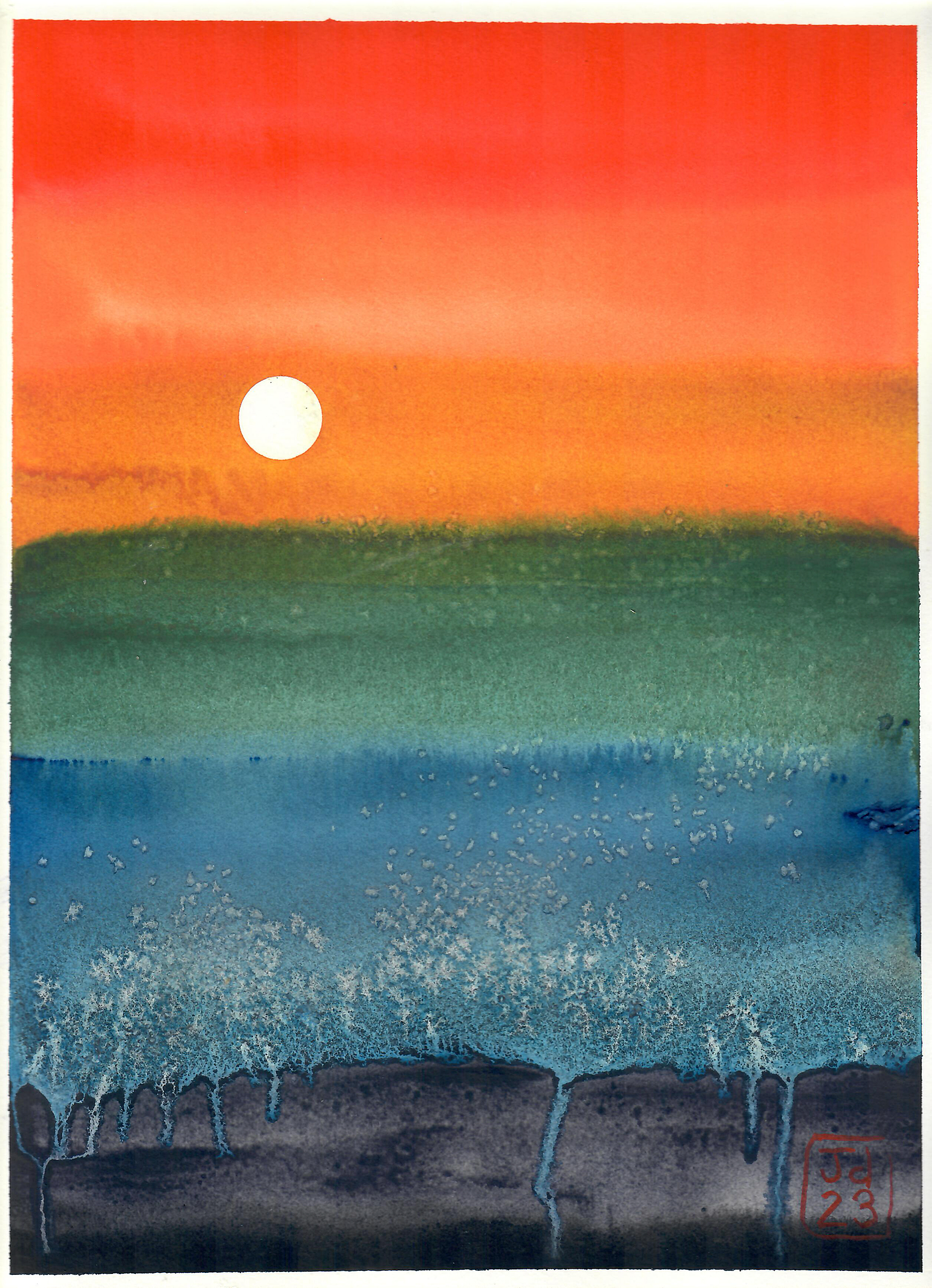
Nice! Almost there. The paint had been too thick on this pass, so it didn’t want to bleed as much, especially at the bottom. Plus, I ended up with two globs of chunky paint on the paper when I was finished. I had to fish those off. (You can see the spots they landed, though, in the green and the blue on the right.)
I decided to make another pass. So, this is what I painted last night:
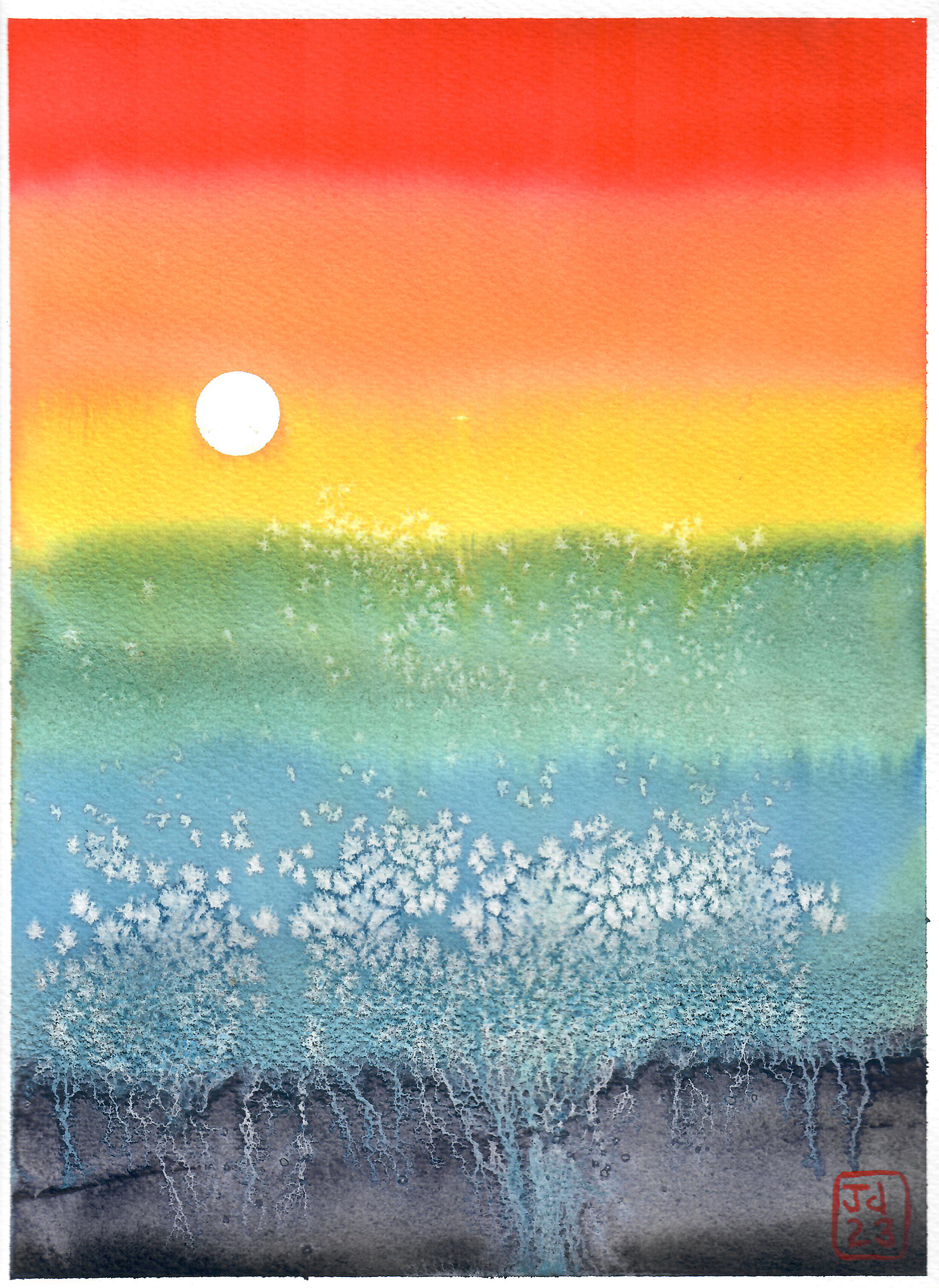
It’s not exactly what I want, but I have to stop for now. I ran out of my purple paint. I’d used an entire small tube (5ml) of Daniel Smith’s Moonglow in order to produce these seven paintings.
When I showed the final two paintings to Kim this morning, she really liked them — especially #6 (the one with the thicker, more intense colors). I feel like I’m finished with this for now, but might revisit in the future. The more I work with this, the more I understand how to achieve the effects I want. (I particularly like the crystalline formations that result from the table salt. Very nice. Looks like organic creatures or plants!)
This project made me realize why art can be so expensive sometimes. Here are my material costs for this project:
- About $15 for paper. (I used seven sheets of good quality paper. It costs just over $2 per sheet.)
- About $7 for the tube of Moonglow paint.
- An unknown amount of money for the other paint. But if we were to assume seven colors times $7, that’d be $49! Plus maybe a buck for the black paint I used. So, that’s about $50 in paint.
My total cost, then, is somewhere on the order of $65 to produce these seven pieces.
Now, admittedly I’m using an unconventional watercolor style here. Watercolor paint is meant to be used sparingly. In 99.9% of cases, your pigment is very dilute when applied to paper. I was trying something…experimental. But still. My point is that art can be expensive because it takes time, money, and creativity to produce. (At this point, I probably have eight hours into this project.)
I enjoyed creating these abstract paintings. Every other painting assignment we’ve had has been pretty specific. Paint these birds. Paint a winter landscape. Paint a jellyfish. And while it’s true that I’ve done a couple of projects for myself, they were all based on existing works. This was the first time I’ve conceived something of my own from start to finish. All of this is out of my head. None of it is based on anything else. I’m proud of that.
The best part? I’ve discovered a couple of new techniques that excite me. I really like the intense colors, even though I know that’s not “proper” watercolor technique. And I especially like the comic-book style panels. You can bet that I’m going to return to this concept again and again and again.
I’m eager to go downstairs and paint, but I don’t have time today. I’ve got other projects that need to be completed. But I’ll get some more painting in soon. Our next assignment is to paint a still life of fruit.
If you like saturated colours try using gouache. It is an opaque watercolour. When I lived in the Caribbean I tried using plain watercolour but it wasn’t strong enough to capture the intense light. A painting using both watercolour and gouache together would be interesting.
Oh, thanks for the suggestion! I have a few tubes of gouache, but I haven’t even opened them. I don’t know what it looks like when used. I ought to experiment.
These look great! #6 is also my favourite. It seems to me that #6 and #7 are complementary: #6 is sunset, #7 is sunrise.
I really like #4! It’s interesting and feels like a puzzle. And I love that there’s a story to it. Thank you for sharing your work with us.
I really like the dots! Thurs afternoon (thin tape) was my favorite. And I don’t usually even like abstract act. Are you willing to sell that one?
I thought the landscape effect was intentional. It was there even with the grids. And it is beautiful.
But how can it be okay to leave out the dots? They were your reason, were they not? Have I missed a more subtle nod to each in the final drawings?
Good questions, Gwen. Think of these as two different works. Once I decided to leave the gridlines, the dots no longer mattered. The dots mean something to me when the grids are in place. When they’re gone, I’m trying to portray something else.
That all seems so strange (and pretentious) to say, but it’s true!
Just got your final GRS newsletter and had to check out this post that you linked! It is very interesting to read about how this process unfolded and provides insight into why artists often paint series of the same subject – little tweak, variations, and experiments on the same theme. How cool!
When I saw #5 with the alcohol dots, I thought it was intentional to make the dots less stark because of Kim’s comment, but the pattern was different. I saw your reply above about the dots not mattering once the gridlines were removed, but couldn’t they be placed in the painting using alcohol dots in the same pattern and sections of the painting without gridlines? The story would be even more abstract than delineating the sections with lines (at least in the story I’ve made up in my head about what this is about. In reality, the lines may mean something completely different and have to be there! LOL)
Art is very thought-provoking to the artist and the viewer as your post so clearly illustrates!
A great experimentation process! If you like more intense colours, you could consider acrylic paint – it’s water based and dries quickly, but not as fast as watercolour.
Abstraction is freeing and demanding at the same time. I love the first effort and I love the final effort. Thanks for showing your process. It is fun.