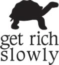
Over the past couple of weeks, I’ve been working with a real-life graphic designer to develop a logo (and eventually a new layout) for Get Rich Slowly. She provided me with a sheet of possible logos based on my vision for the site. Many were great, but I loved none more than this, which I think was only an afterthought on her part:

Something about the tortoise just grabbed me. He’s so damn cute! I told my designer that I wanted my site to be serious and classy (and classic), but also whimsical. I want it to have a sense of humor. I think this captures that very well. Plus I can’t help but think of the different ways the tortoise (who needs a name) could be used around the site. It’s branding!
I suggested that it might be fun to see a variation with the tortoise standing on top of the site name:

I like this version best of the two, but it’s less practical. For the web — and for print — the wide aspect-ratio is necessary. Still, I think the tortoise on top represents success. I may end up using this variation in certain circumstances (coffee mugs?).
This morning, my designer sent me variations of both logos, but with a spot of color. Kris likes the green better than the black. What do you think?


Finally, here’s the proposed business card. It would be two-sided. The first side would contain the logo and the contact information. The second side would contain a handful of provocative questions and the URL.

There you go. My first steps toward “branding”. I’d love to hear some feedback. Do you prefer the stacked version or the wide version? Black or green? (Or some combination?) Love it? Hate it? Ambivalent? I’m unlikely to change things substantially at this point because I like the tortoise motif a lot, but I’d love to hear constructive criticism on what works and what doesn’t.

I agree with you about the using the long logo for most cases, and the stacked for special. I don’t like that shade of green, and really the black looks best to me. Unless you faded from red to green…
About your business card, I would leave the back blank so people can write notes or such on them.
-palmer
I like the long version better. In the green is the text the same color as the tortoise? They look like different shades, which is annoying. Also, after having many things printed for work, trying to get the ‘same shade of green’ from different printers and on different media can be really hard. If you go for the green, do not be too attached to the perfect shade.
I like the long version better, too. It emphasizes the long, slow road. I don’t like the logo in all green. It might work better to have a green tortoise and black words. Then you don’t have to worry about the matching green issue as mentioned by Tiffany. Looks good!
I definitely like the long version better. The tortoise almost acts a pause, like Get Rich – slowly, which puts the two draw words up front (get rich!) but then lays out the ground rules. I like the idea of green – more unique, plus green has a money symbolism, but I’d go with a deep forest green. I don’t like the mint colored turtle.
I like the long version for web purposes, but the stacked version might look better on a business card. I don’t care for the all green logo — but I wonder what it would look like with a green tortoise and black text.
Oooo, I think a good name for the turtle would be Creeping Charlie, which is the name of a houseplant I want to get for my new condo … these plants grow and grow and eventually creep all over the joint, sort of how we want our money to do. 😉
You might want to consider printing costs. Each color you add makes it more expensive. However, I think that a distinctive shade of green in the logo (perhaps just the tortoise?) helps make it more unique and recognizable as your own. Color has a lot of power.
Darker green tortoise with black letters?
Or perhaps more contrast between the tortoise and the text so that it looks more intentional? Very dark green text with a lighter tortoise?
Right now, the draft of your business card doesn’t have your name on it. If you’re expecting people to recognize it in your e-mail address, I think you’re asking a bit much.
Or how about black lettering on a green background? Then you could use green paper for your biz card, etc.
I also like get rich…….slowly………turtle.
Too bad I’m not clever enough to make the word slowly into the shape of a turtle–too literal?
I like the long version better. I do have a small beef. I think the turtle with only two legs is a little weird. I think that adding two background legs would give it more depth. Just a suggestion.
Love the questions on the back. Creates a little intrigue.
I think I vote for the black actually. And I really like the questions on the back.
Also, random question from another blogger: What do you anticipate using the business cards for? (Thus far all of my promotional endeavors have occurred online as opposed to offline, and I’m curious what you have in mind.)
I like the black stacked. I understand that doesn’t work well for webpages…but I think for the card it would be good. I don’t like the green very much – to muted.
I agree that the back should be blank. I think the questions could limit you a bit…if you find someone that isn’t interested in those things, or has concerns you don’t cover there. You don’t want to limit yourself in advertising…and I think those questions do that.
I am so surprised that you are changing your site! I love the simplicity of it. tthe tree just fits, as does the simplicity, of what you are about. Having said that, green turtle, in the middle.